
Last updated: July 9, 2026
This guide provides step-by-step instructions and labeled screenshots to help you navigate the dashboard with ease. It’s designed to highlight key features, simplify your experience, and ensure you can quickly access the data.
Step 1: Initial Landing Page on the Website
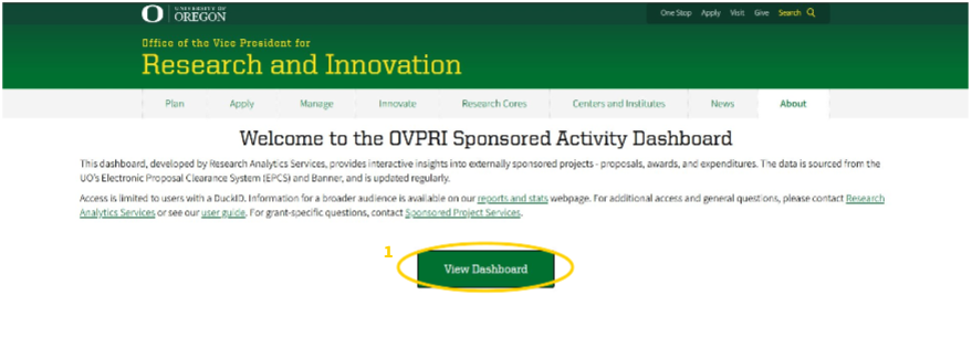
- Initial Page, get started by clicking on the “View Dashboard” button. This opens the dashboard in a new Power BI tab.
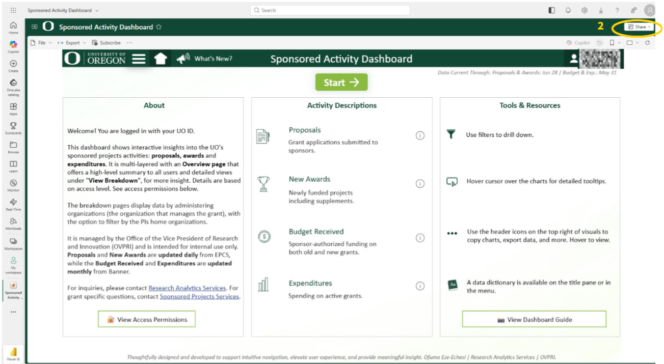
- On the dashboard page, you can share the dashboard with others and access additional features.
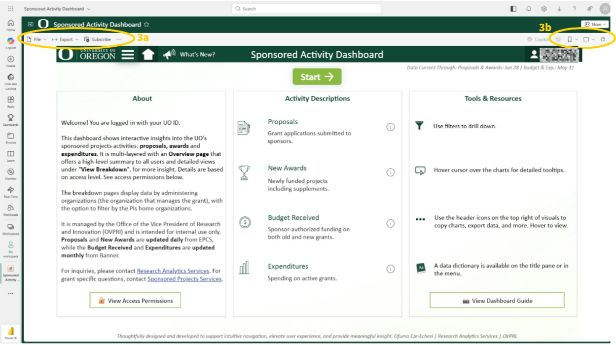
There are features on the desktop version that can help the user navigate through easier.
a. Bookmark Button: Saves a selected view of the dashboard, including all applied filters.
b. Other Buttons: File, export, share, and more buttons to access additional options and manage the dashboard efficiently.
Step 2: The Home Page
- Information on when data was last uploaded will be visible to the user at the top right under the pane.
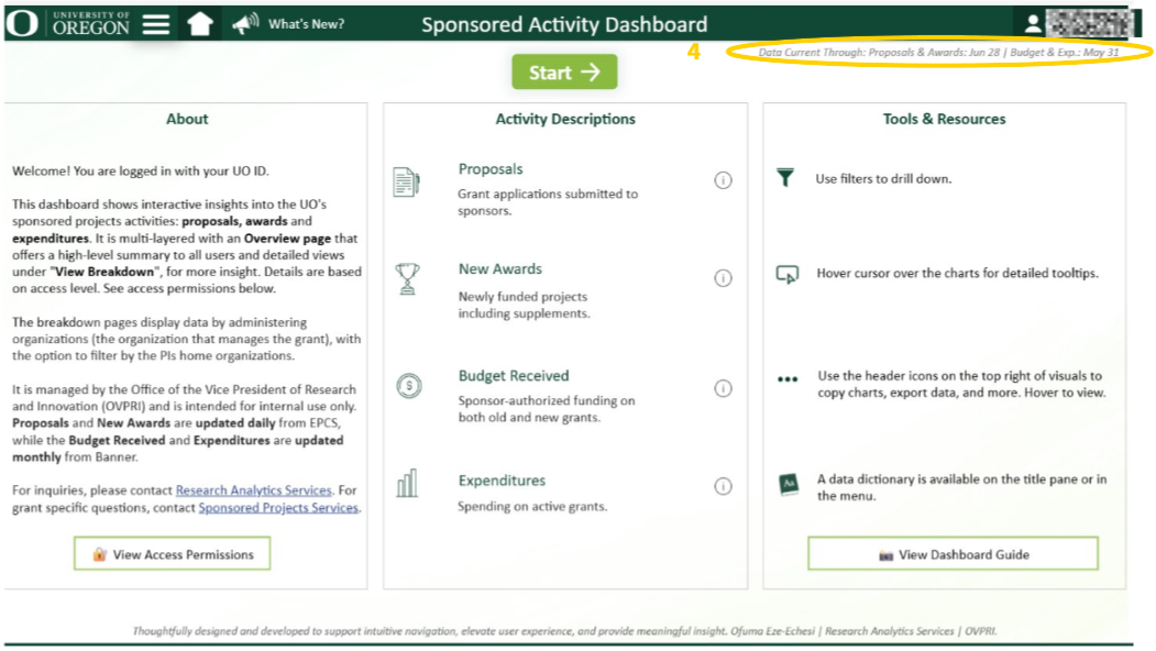
- Review the About, Activity Descriptions, and Tools & Resources panels for an introduction to the report and how to effectively navigate this dashboard.
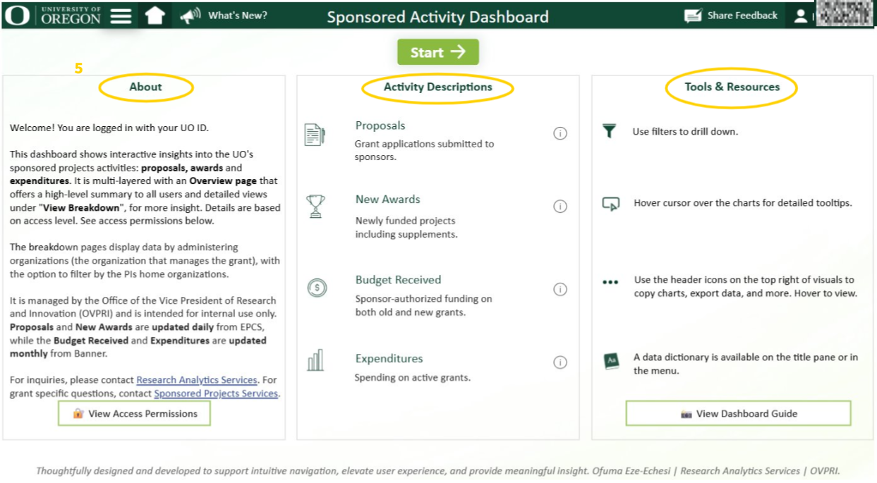
Use icons in the title pane (top of screen) to navigate the dashboard. Below are the icons and their uses:
a. University of Oregon logo: Navigates to the research analytics webpage.
b. Hamburger Icon (3 horizontal lines): Displays the menu items of the dashboard.
c. “What’s New?” Icon: Provides information on all updates.
d. “Share Feedback” Icon: Redirects to a short survey to share thoughts and suggestions about the dashboard
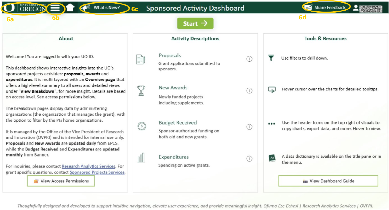
Use the buttons within the page for additional information.
a. About Section: Use the “View Access Permissions” button to view the details on permissions and access levels.
b. Activity Descriptions: Use the information button (i) next to each activity to learn more about each activity.
c. Tools & Resources: Use the “View Dashboard Guide” button to view details of how to use the dashboard.
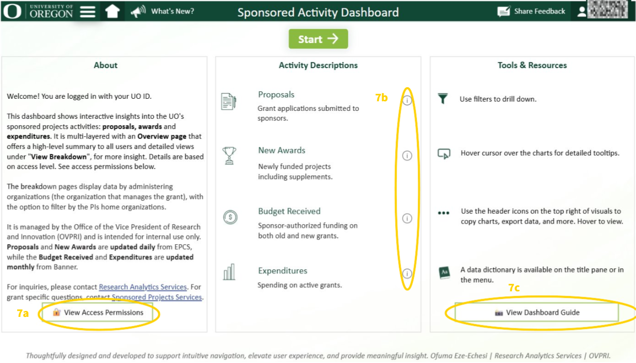
- Click on the “Start” button to start viewing the data beginning with the overview page
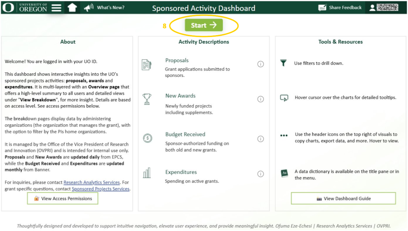
Step 3: The Overview page – Review the metrics
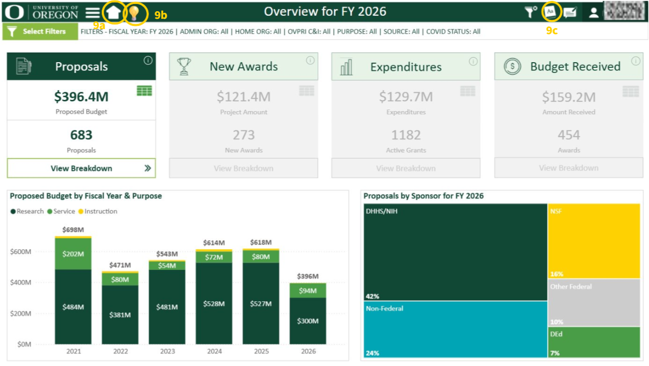
This page shows a high-level overview of the four activities captured within the report. The default activity with the charts displayed is proposals.
The icons on the title pane to navigate this page.
a. Home Button: Takes user back to home/introduction page.
b. Lightbulb Button: Opens a webpage providing updates on Federal Actions Related to Research.
c. Dictionary Icon: Gives information and a description about each field.
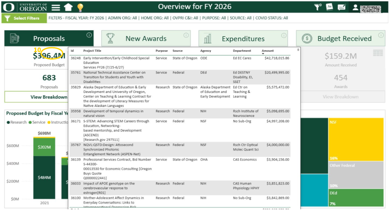
- Hover cursor over the amounts for a high-level breakdown
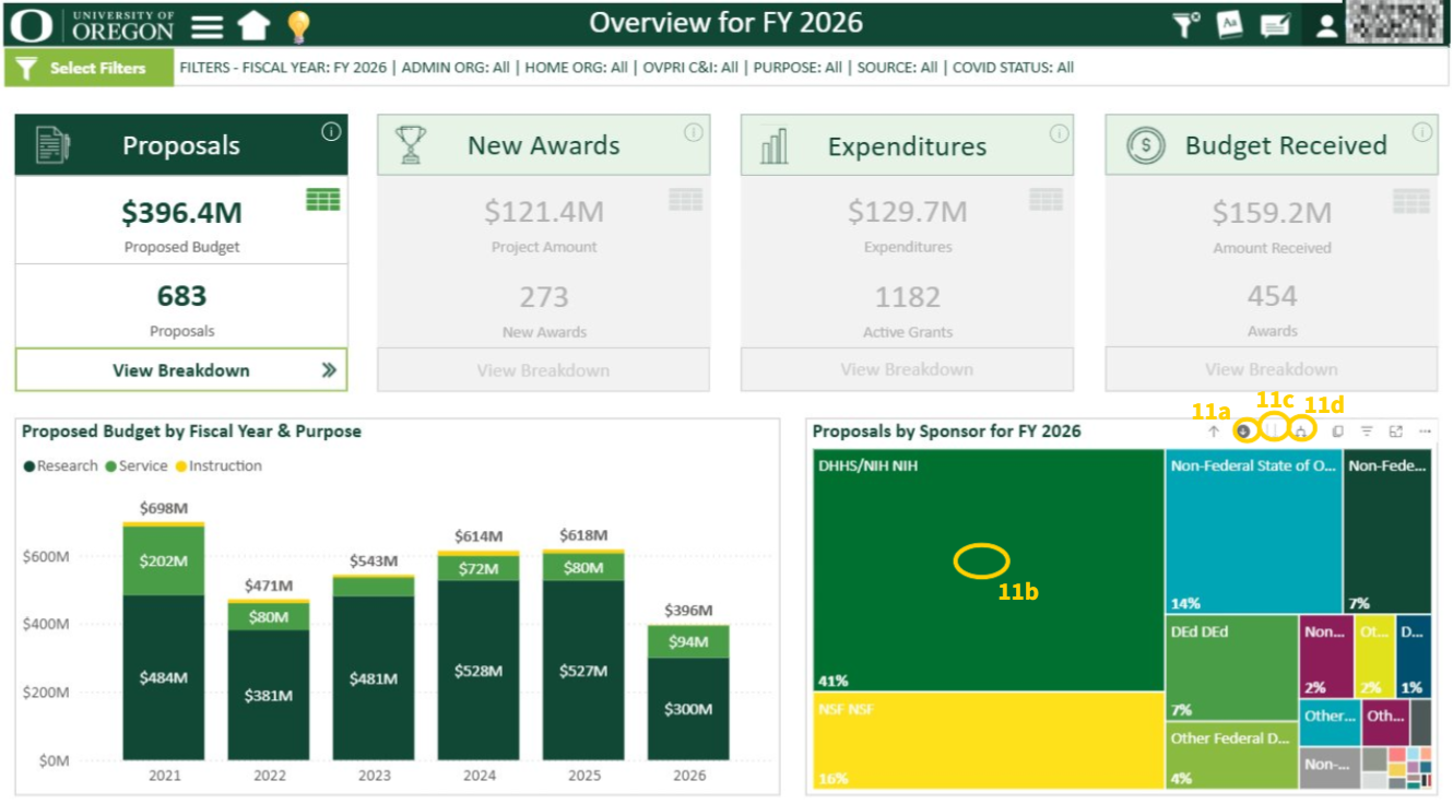
Drill Down Capabilities: Use this to explore data in increasing levels of detail.
a. Drill down: Click the down arrow to enable the drill down feature. Once selected, click on any of the sponsor groups to view the breakdown of the respective group.
b. Double Drill Down: To view the overall breakdown to the furthest level of detail, use the double down arrow
c. Drill up: To go back to the original or default view, click on the up arrow button on the chart or the reset filter button at the top of the page
d. Expand all levels: Use the forked double arrow icon to display the next level across all sponsor groups. Sponsor chart has three levels in the hierarchy:
- Agency Group: Initial view which displays DHHS/NIH, NSF, DEd, Other Federal & Non-federal.
- Agency Subgroup: Subcategories of the groups in the initial view. For example, non-federal will be broken down into Foundations and Associations, State of Oregon, etc.
- Agency Detail: This breaks subgroups into specific entities. For example, Foundations and Associations will be further broken down into its specific organizations, such as Bill and Melinda Gates Foundation, Spencer Foundation, etc.
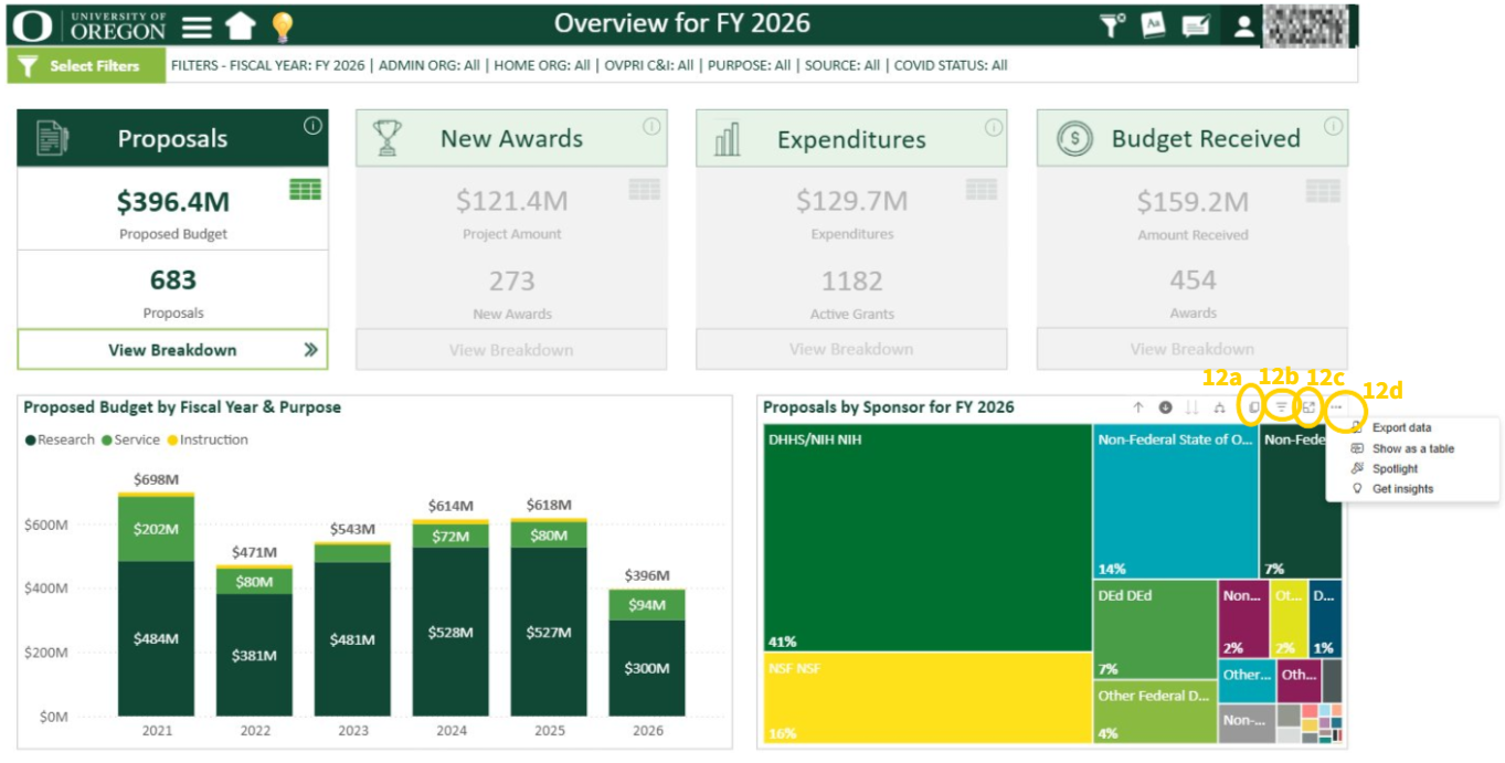
Additional Features for the Tree Map.
a. Copy Image Button: Creates an image of the tree map with a caption created.
b. Filters & Slicers Info: Hover over to view the filters and slicers that affect the data presented.
c. Focus Mode: Takes user to a screen just showing the tree map.
d. Ellipses (3 dots): Click to use abilities such as exporting data, showing as a table, etc.
- Information button: Provides a summary of the selected activity.
- Table icon: View selected activity in a table
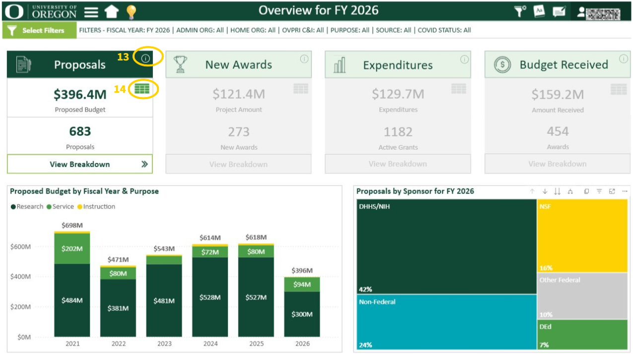
a. Download Data: Hover over the top right of the table and click on the ellipses (3 dots) and export data. Select any of the other options as needed.
b. Back Arrow Button: Takes user back to the overview page.
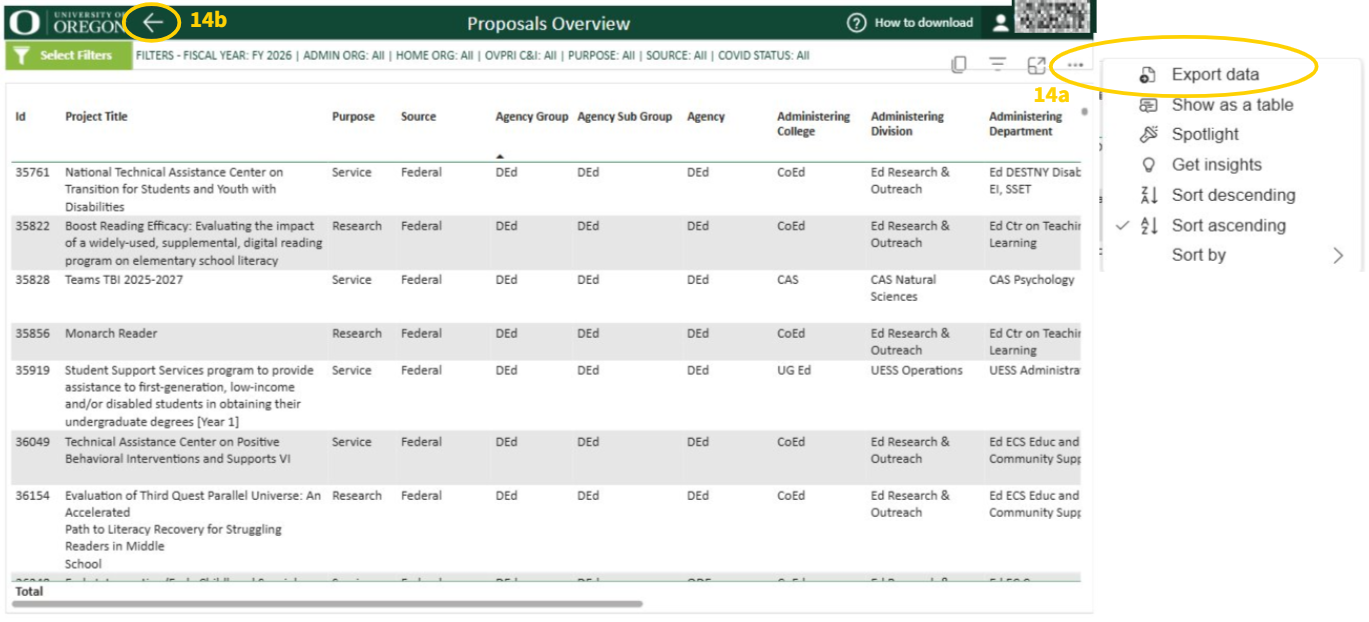
Filters
a. “Select Filters” Button: Choose filters across multiple fields.
b. “Reset Filters” Button: Reset to default filters.
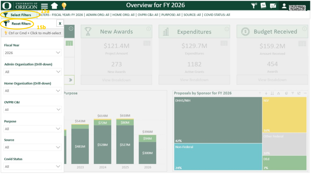
- Activity titles (New Awards, Amounts Received, etc.): Click to view their corresponding charts below the KPI cards.
- IMPORTANT: Click on “View Breakdown” to see more detailed info on the activity.
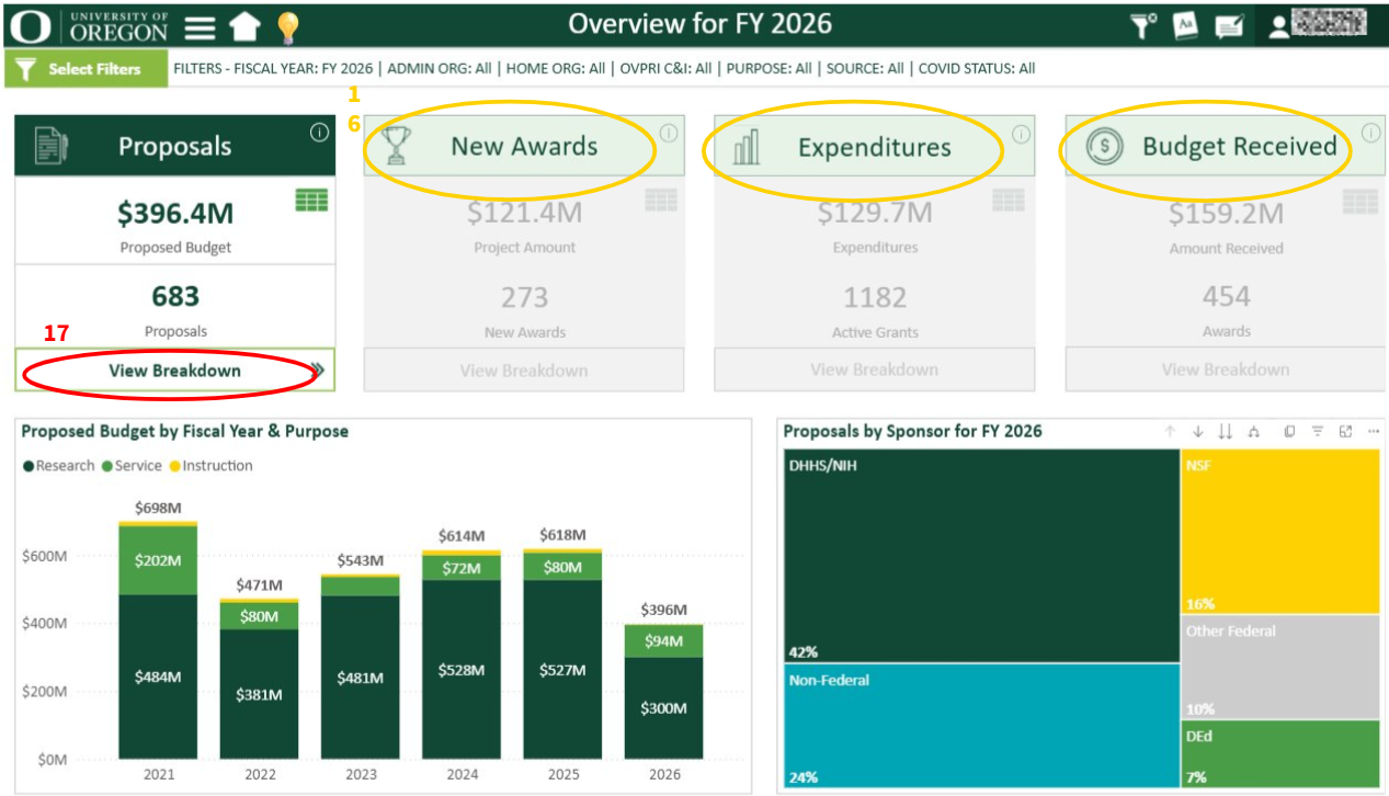
Step 4: Breakdown Pages - Review Key Metrics
View the breakdown pages for Proposals, New Awards, Amounts Received, and Expenditures. The data displays more detailed information for each activity and updates dynamically based on your filters
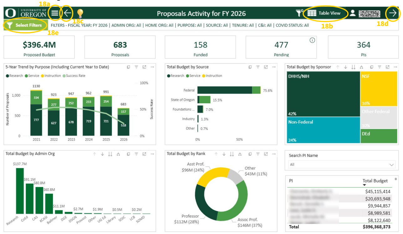
Title pane icons
a. Hamburger icon: Includes options such as table view, other overview pages, data dictionary, etc. Refer to Step 2, (Figure 6)
b. Table view: Provides breakdown of the analysis in table view. Refer to Step 3, (Figure 14).
c. Left arrow: Directs users to the previous breakdown page
d. Right arrow: Directs users to the next breakdown page
e. “Select Filters”: Allows users to Select and Reset filters in the filter pane, as shown in Step 3, (Figure 15).
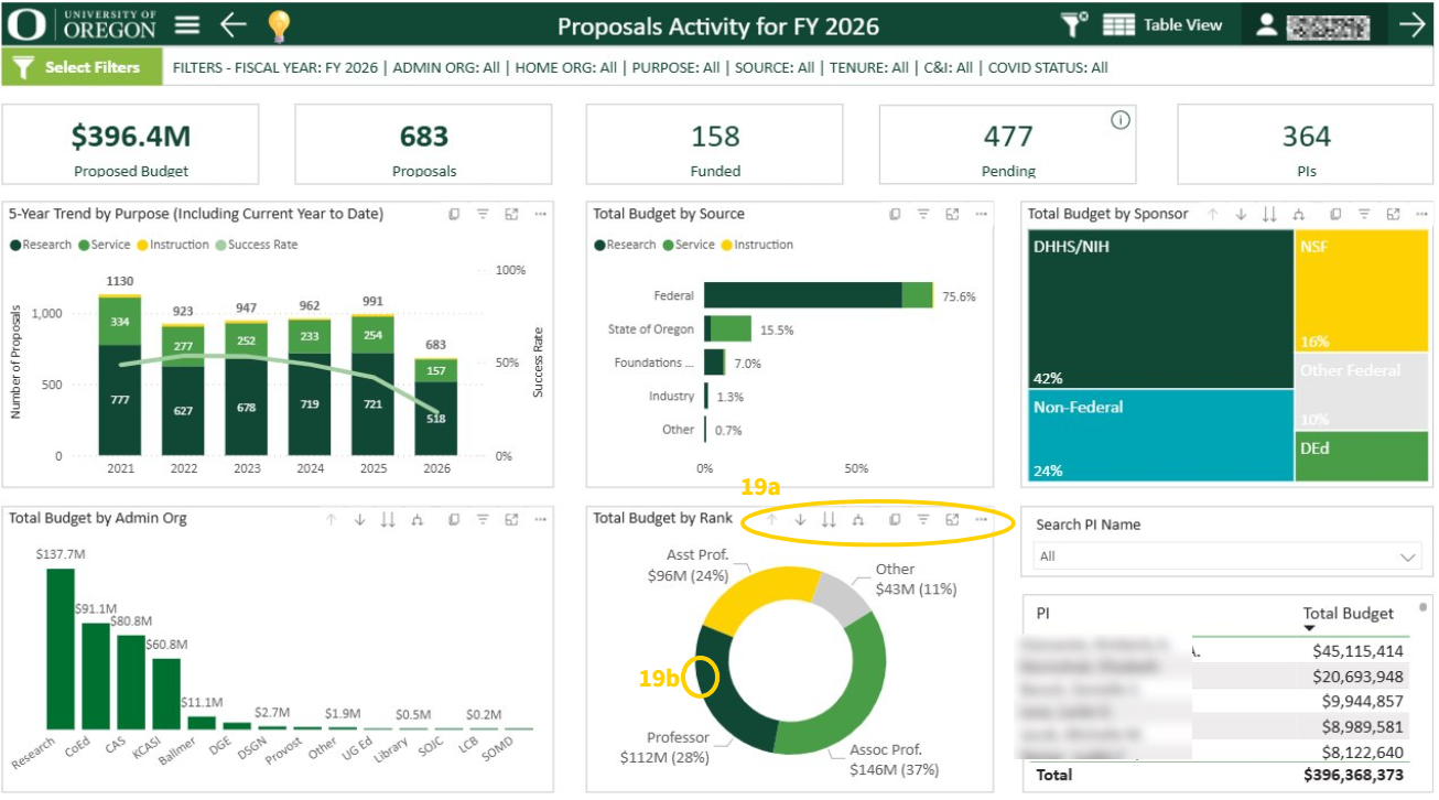
Donut and Tree Map Charts Drill Down Capabilities
a. Drilling Features: On the top of the “Total Budget by Rank” chart (donut chart) and the “Total Budget by Sponsor” chart (tree map), use the features circled to use the drilling capabilities. Refer to Step 3, (Figures 11-12).
b. When selected, click any of the bars or on the donut or tree map to drill down and more. Refer to Step 3, (Figures 11-12).
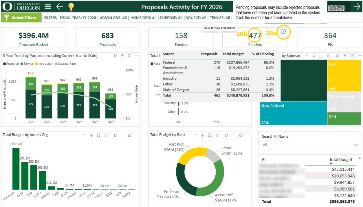
Pending KPI card
a. Hover over the pending card info icon (i) to read about the pending proposals.
b. Click on the amount pending to view the breakdown of pending proposals.
- Hover cursor over any of the charts to see detailed tooltips.
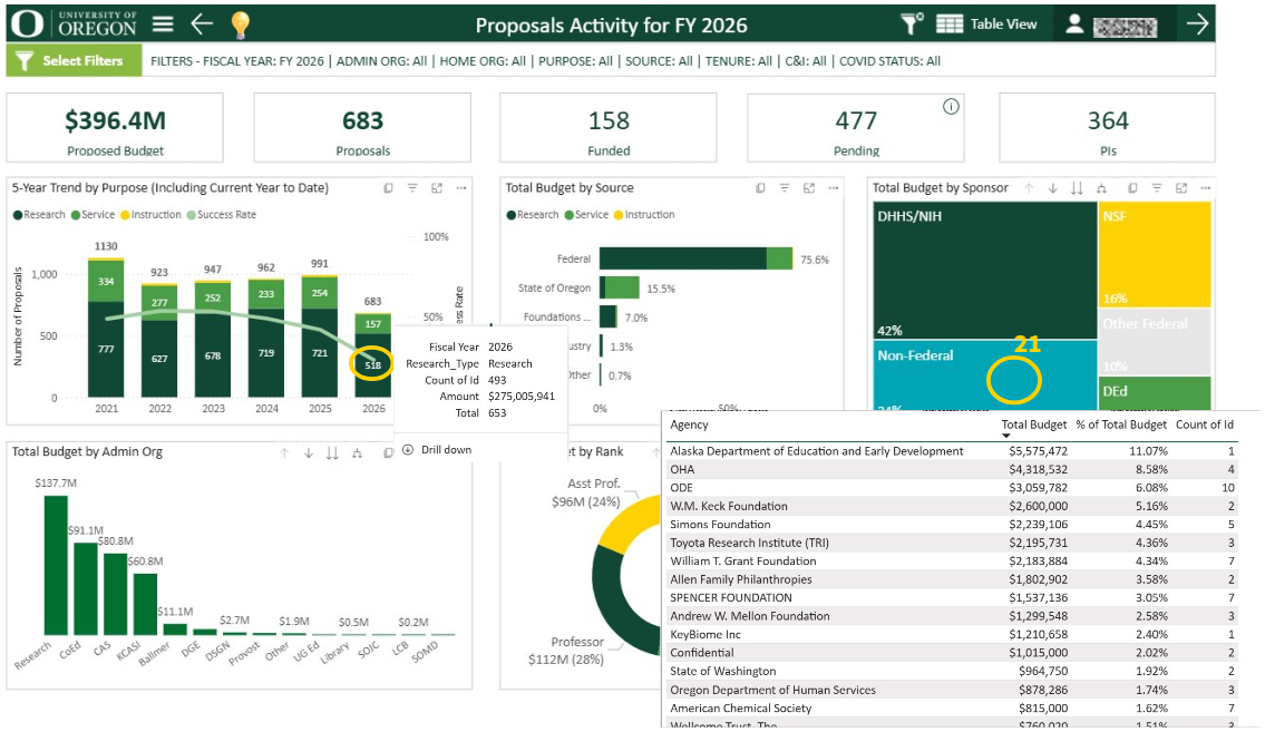
- Use the search bar to look for PIs.
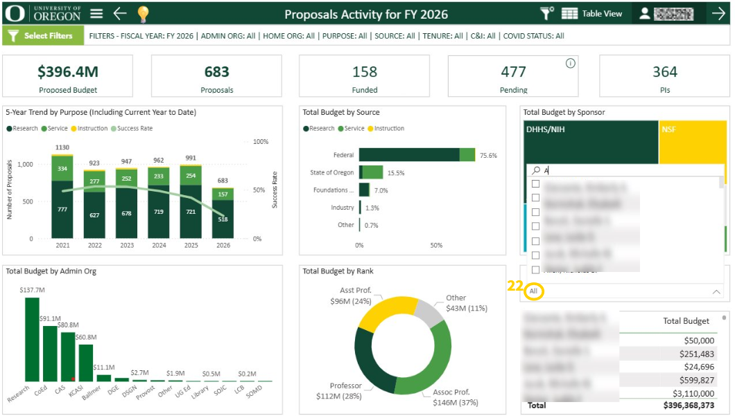
The other breakdown pages are similar and the above instructions apply.
For questions, contact Research Analytics Services. For suggestions, fill out the feedback form linked in the “Share Feedback” button in the menu pane.